


The European box art for the Game of the Year edition of last year’s blockbuster Batman: Arkham City won’t be as bad as the North American version when it comes out for Xbox 360 and PlayStation 3 next fall, according to Reddit user Another4everAloneGuy.
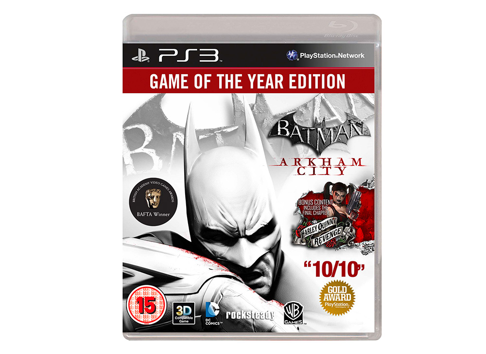
The original cover (below, left) received criticism for its shotgun blast of accolades cluttering the art, including a huge splash of the “10 out of 10” rating from GameInformer that was featured more prominently than the title of the game, which is tucked unobtrusively off to the side just above the oversized blurb about the bonus content.
The image I retrieved from Reddit (below, right) is much cleaner. Not only is the GameInformer score gone, but the title is larger and moved up to a more prominent space. A picture of Arkham City’s upcoming downloadable content’s villain, Harley Quinn, also replaces most of the fine print in the first version’s “Bonus Content” space. The Reddit cover features three accolades instead of the original’s four, and they’re all smaller than the part where it says, “Batman: Arkham City,” which is as it should be.

Arkham City is not the first Batman game to get this kind of attention. The Game of the Year edition of Arkham Asylum, the preceding title in the series, also caught some flack for its Game of the Year box art (right, below), which had The Dark Knight fighting for space with giant chunky blocks advertising the new 3D functionality and extra content. The designers made him bigger to try to balance it out, but…yeah, that didn’t help so much.

Unfortunately, it looks like North American Batfans will still be stuck with the messy text-fest we’ve already seen when the Arkham City Special Edition comes out on Tuesday.