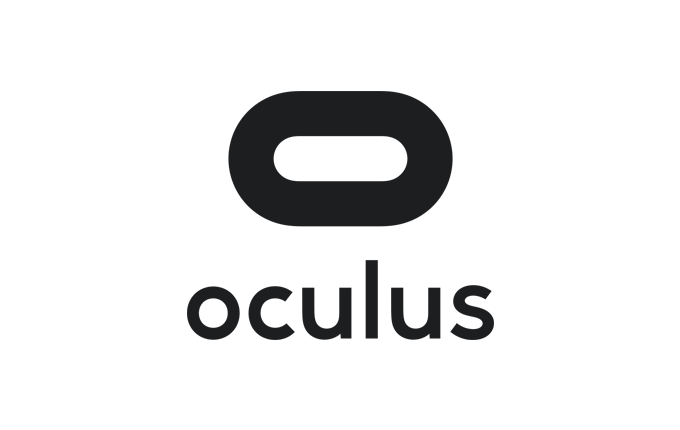
This new logo takes minimalist to a new level.
Oculus launched a new webpage this morning that shows off its new branding for the first time. The virtual reality platform group dropped the eye-themed logo, simplifying the look with a widened “O.” This change comes just ahead of the Facebook-owned company’s first E3-timed press event, slated to kick off Thursday in San Francisco.

Unlock premium content and VIP community perks with GB M A X!
Join now to enjoy our free and premium membership perks.
![]()

![]()