
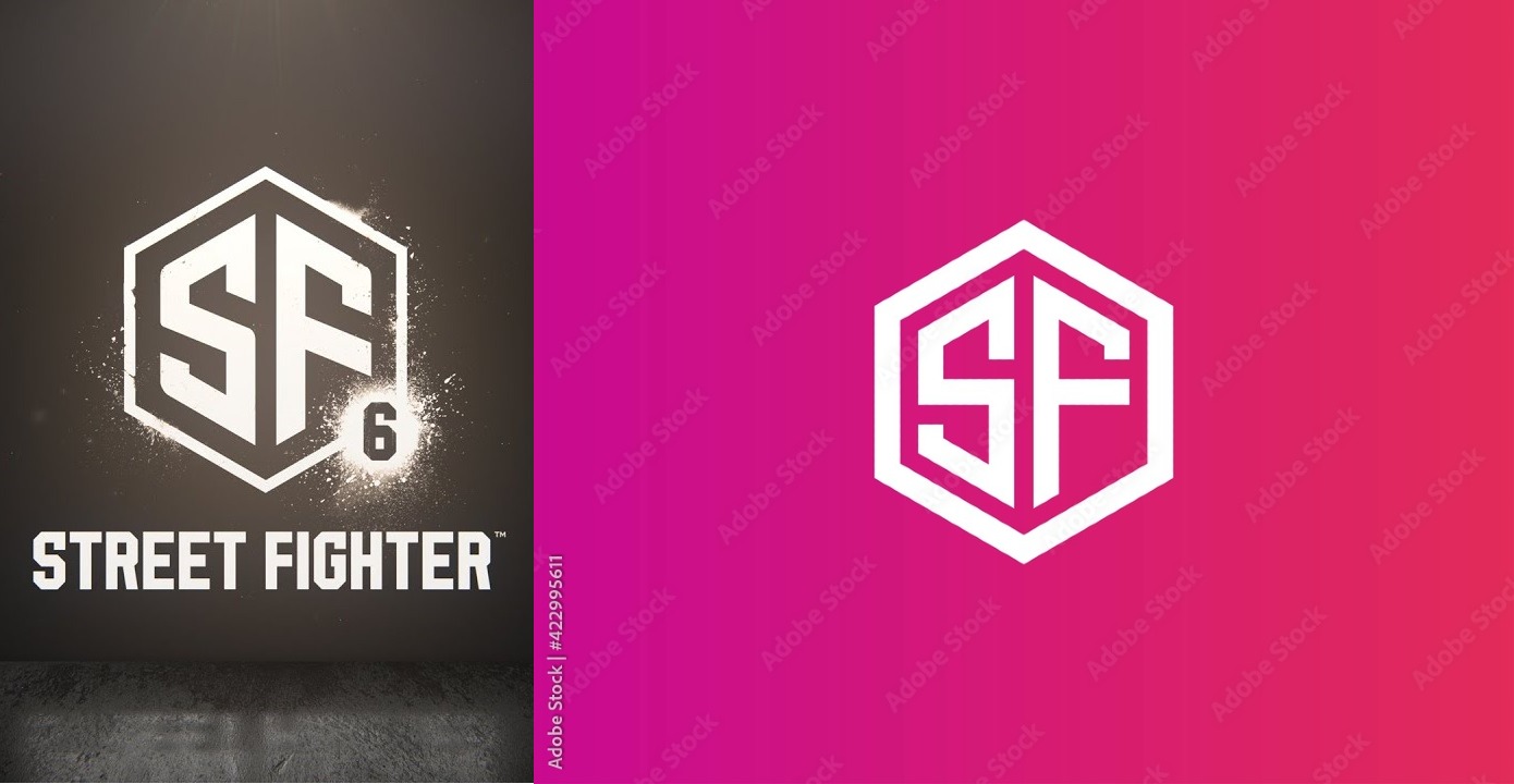
Some eagle-eyed art critics have spotted something interesting about the Street Fighter 6 logo. The logo looks very similar to a stock image found on Adobe’s stock image shop. Fans of the fighting game series are unhappy with the logo’s huge departure from all of the previous logos.
As these things tend to work on social media, it quickly became a storm of joke tweets and complaints. Aurich Lawson, the creative director of Ars Technica jumped in to point out the logo is similar to one found on Adobe’s stock image site.
It’s … pretty similar.
Capcom obviously did some work to the Street Fighter 6 logo. The hexagon border has been thinned out. The letters have been thickened up. The middle-right of the ‘F’ has been warped down slightly, and of course the ‘6’ has been added. There’s also been some weathering done across the whole logo, and a spray paint effect added around the whole thing.
It isn’t a terrible logo, really. It’s just kind of boring.
Capcom’s announcement was really just a teaser trailer, showing off series staple Ryu and relative newcomer Luke. The release date is still a long ways out, most likely. If Street Fighter 6 won’t be coming out for a good long while there’s plenty of time for Capcom to take another swing at a logo.